Matching Exterior Paint to the Hills, Oaks and Vineyards Around Temecula
2026-10-06
Drive out toward the Santa Rosa Plateau in late spring and the palette is already laid out: pale gold grass, grey granite boulders, dark oak canopy, a little green left in the low spots. Paint that sits well in Temecula usually borrows from that range. The reason is practical as much as visual. A colour pulled from the landscape never fights it, and stucco in the valley takes sun and dust the same way the hills do.
This article walks through how the land around Temecula can guide exterior colour choices, where the idea works and where it breaks down, and how to check a landscape-inspired colour on the actual wall before a crew starts.
Why does the landscape matter when choosing a body colour?
A house is seen against something. In Temecula that background is usually dry hillside, vineyard rows, oak trees or the pale haze that hangs over the Inland Empire in summer. A body colour that clashes with that backdrop looks louder than it is, and one that echoes it looks like it belongs to the street.
The effect is easiest to see on a corner lot at the edge of a development, where the house faces open ground. A cool blue-grey body against golden grass reads sharp and slightly cold. A warm sand or soft olive in the same spot looks calm.
Which landscape colours translate to paint?
Not every colour in a view works on a wall. Brilliant spring green on a hillside turns garish on stucco, and the deep purple of a vine leaf in autumn is too dark for a large surface. What translates is the muted layer underneath: the grasses, the stone, the bark, the dust. The table below pairs common local features with the paint families they suggest.
| Local feature | Paint family it suggests | Best used as |
|---|---|---|
| Dry grass on the hills | Pale gold, straw, soft sand | Body colour on larger stucco faces |
| Granite boulders, Santa Rosa Plateau | Warm grey, greige, stone | Body colour or trim colour beside tile |
| Oak bark and shade | Deep brown, umber, bronze | Trim, iron, garage door |
| Vineyard soil in the wine country | Clay, terracotta, muted rust | Accent walls, front door, shutters |
| Sage and olive foliage | Grey-green, olive | Front door, shutters, fence gates |
| Dusty creek beds, Murrieta Creek and Temecula Creek | Taupe, light mushroom | Body colour on walls that collect dust |
The right-hand column matters more than the middle one. A colour that suits a body can look heavy as an accent, and a colour that makes a good door can overwhelm a whole elevation. The same clay red that makes a front door look warm is a poor choice for the full stucco field of a two-storey house.
How does the Santa Margarita River corridor change the picture?
Murrieta Creek and Temecula Creek meet and form the Santa Margarita River, and homes near that corridor sit in a slightly different light and setting from homes up on the dry slopes. There is more green, more shade from sycamores and cottonwoods, and on cool mornings more moisture in the air. Colours that look right on an open hillside lot can look washed out in that shade.
In practice, a house under heavy tree cover usually wants a body colour a notch warmer and a touch darker than the same house would take in full sun. Shade drains warmth from paint. A pale grey that looks crisp in the sun reads dead and bluish in the shade, and the sample swatch has to be tested in the exact spot where the wall will live. Moss and algae on a north wall in a damp corner are a separate matter that calls for washing and a proper primer, but colour choice should account for them too, because a mid-value tan hides streaking better than a very light one.
Does the wine-country look suit a tract home?
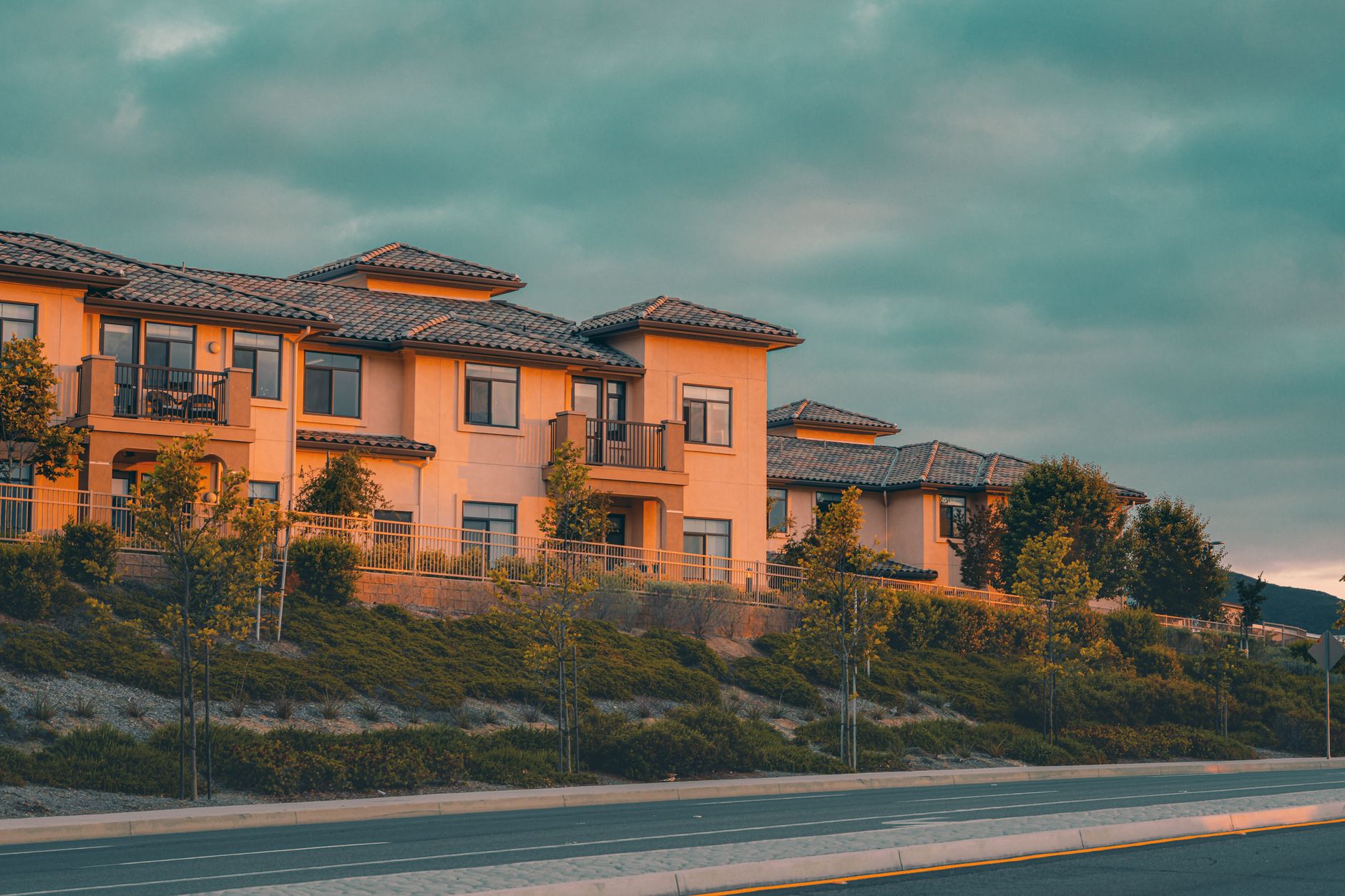
People moving into a tract home often want the estate look of the Temecula Valley wine country: warm plaster, dark timber, iron lanterns. Stucco and tile get part of the way there on their own. What a tract home lacks is the depth of colour that an old plastered wall develops over decades.
The closest approach in paint is layered tone. A warm sand body with a slightly deeper trim colour around the windows, a bronze-brown on the garage door and railings, and an olive or deep red on the front door gives the elevation the same stacked colours a vineyard building has. Avoid copying it fully. A tract home with a faux-estate palette in five shades looks busy, and a block of those on one street looks like a theme park. Three colours done carefully read as more convincing.
- One body colour for the stucco field, kept to a mid value.
- One trim colour for fascia, window recesses and the garage door, set a few steps from the body.
- One accent for the front door, with the same undertone family as the other two.
- Iron and rails in a dark bronze or near-black, matched to the door hardware.
What goes wrong when a landscape colour reaches the wall?
Three problems come up again and again. The first is scale. A small colour chip of sage looks calm. A whole two-storey elevation of it looks green, and the grey in the colour disappears. Always judge with a large board, ideally two feet square, and look at it from the street.
The second is the sun. Colours inspired by dry grass lean yellow, and strong inland light pushes yellow further. A straw colour that looks neutral in a shaded porch can turn mustard on a south face by afternoon. Test the board on the south wall at one o'clock and again near five, when the low light turns everything warmer.
The third is the roof. Terracotta, brown and blended tile all carry their own undertone, and the wall has to agree with it. A greige body that looks lovely in the sample can go slightly pink beside an orange tile or slightly green beside a grey-brown one. Hold the board up against the roof edge before deciding.
How does Pechanga-area and Riverside County housing change the approach?
Housing across Riverside County mixes eras. Older ranch houses near the original town centre often have smooth or lightly sanded stucco, wood trim and shingle roofs. Newer communities, including those in the Pechanga area, tend toward heavier texture, tile roofs and shared design guidelines. The texture matters because rough stucco throws small shadows that make a colour read darker than the sample, while smooth stucco shows the colour more directly.
On a heavily textured wall, step the body colour slightly lighter than the first instinct. On a smooth wall, step it slightly deeper. Many tract communities also review colours through an association, so the landscape idea has to fit the approved list. Inside a short palette, the earth tones usually come first anyway, since sand, taupe and soft olive appear on almost every list.
How should the final choice be tested?
A reliable test takes three days and a few sample pots. Paint two boards per candidate. Put one on the south side and one under the eave on the north side. Look at them early, at midday and in the evening, and look at them from the street as well as from arm's length.
Then place the trim colour and the door colour board beside each body candidate. A pairing that survives all those checks is ready. A pairing that has to be explained, with phrases like it looks better when the sun comes out, is not ready.
Coverage deserves a mention at this stage. Two coats of the final colour over a properly primed surface give the depth the sample showed. One coat over old paint of a different value gives a muddy version of it, and a landscape colour is subtle enough that the muddiness shows. Patching, sanding and a scuff of any glossy surface come before the topcoat, because a colour taken from nature should not wear the marks of a repair.
Is a landscape-inspired palette the safe choice?
It is the lower-risk choice, which is not the same as the best one in every case. A house at the end of a street with a distinctive roof or an unusual stone feature may want a colour that answers that feature instead. A house with a lot of dark iron may want a lighter body to keep the contrast crisp. The landscape gives a starting point, and the wall, the roof and the light give the final answer.
Colours taken from the hills and the vines hold up in Temecula because they match what the sun does to everything else here.